A week ago, I described hearing an economist put the cart before the horse. I happened to see his name in yesterday’s newspaper, right next to the phrase “Nobel Prize winner.” Oops.
Undeterred, however, I’d like to describe another case of an economist getting it, if not backward, then at least sideways.
A few weeks ago, the Wall Street Journal published an op-ed by Arthur Laffer, creator of the Laffer Curve, which became the fountainhead of Reagonomics. Laffer argued that stimulus spending makes recessions worse. His evidence for this was a table comparing the change in government spending to the change in GDP for the 34 OECD countries from 2007–2009. (See the op-ed, including the data, here.)
I must have too much time on my hands, because I put the numbers into a spreadsheet and did the math. The correlation that Laffer described is there, but is not impressively strong. It also turns out to be heavily influenced by Ireland and the economic powerhouse that is Estonia. Both are outliers in the data. Removing them cuts the correlation in half, reducing it to a level of significance that doesn’t merit space in the Journal.
Moreover, Laffer was confusing correlation with causality. This is a rookie mistake – not exactly Nobel Prize material. It is, for example, at least equally plausible that countries which were more severely affected by the recession felt compelled to spend more in order to try and counteract it.
Of course, Laffer might well be right. Around the time his article appeared, I heard on CNN that the $2.4 trillion Ben Bernanke injected into the US economy created 2 million jobs. That works out to $1.2 million per job. It would have been much cheaper to simply pay people not to work. But the data Laffer used don’t prove his point. He was speaking from theory, not from fact. Disingenuous is the word that comes to mind.
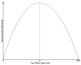
One thing Laffer did get right, however, was his original curve. As it became popularized, it is understood to make the case that lowering taxes will increase tax revenues. What Laffer actually said was that there are two tax rates that will produce no revenue – 0% and 100%. (Laffer, by the way disclaims credit for the idea and attributes it to a 14th Century Muslim scholar. Go figure.)
So the Laffer Curve actually looks like this (graphic shamelessly lifted from Wikipedia):
This graph is purely illustrative, which raises two questions:
1) What is the actual shape of the curve (i.e., where’s the hump)?
2) Which side of the hump are we on?
There. I’ve done it. I’ve achieved one my life goals. I’ve used the word “hump” in two sentences, neither of which is about the sensuous pleasures of airport security. I also want to ride in a limo with American flags on the fenders. But I digress.
I would have thought that finding the high point on the curve would be relatively easy, but from what I’ve read, apparently it isn’t. Even so, we’re left with a shallow debate. David Frum, whose Republican credentials include having served as a speechwriter for George W. Bush, complains that his party has been reduced to one idea: cut taxes for the wealthy (note: if you want to cut taxes, you have to cut them for the wealthy because that’s who pays the taxes). The Democrats on the other hand, have yet to meet a tax they didn’t want to hike.
There’s an empirical answer in there somewhere, not that either side seems to care. There also are some inconvenient facts about who pays how much that neither side wants to pay attention to.
That will be the subject of another post – perhaps later this week. Until then, I’m going to revel in the achievement of a goal and turn my attention back to thinking of all the ways I can use the word “feck” in a sentence.

Hi Dan,
Always enjoy reading your posts. This one reminded me of one of the famous scenes in Ferris Bueller’s Day Off! Enjoy! http://youtu.be/uhiCFdWeQfA
Great stuff, Erik. I watched the video, and you know, even though you can’t see the board, Ben Stein got it right! Not that this enlivened the students any. Now I know how my readers feel.