There’s been a lot of noise in the marketing community over the past few months about Pepsico’s “re-imaging” of its major brands. These efforts have ranged from puzzling to disastrous. 
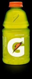
Gatorade’s rebranding of its classic product as “G” drew mild protests. Apparently, consumers were supposed to understand that a G with a lightning bolt represents “the heart, hustle and soul of athleticism (that) will become a badge of pride for anyone who sweats.” But it left at least some consumers uncertain what was in the bottle, so they chose to buy something else.
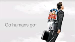
Meanwhile, Quaker Oats introduced this new image for its flagship product:

It probably says more about me than about the ad, but I think it suggests an unfortunate encounter between a severe case of flatulence and an open flame. At least one analyst has an even more scatological interpretation.
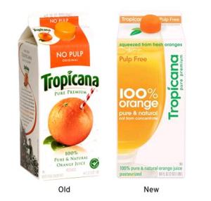
Tropicana got the most attention because the decision to abandon the “straw-in-the-orange” icon was an immediate, visible flop.
Pepsi pulled the new Tropicana package design from shelves in less than two months, after reportedly losing $33 million in sales (friends who have contacts at Pepsi tell me the actual cost was much higher).
The strangest case, though, is the new look for Pepsi itself – not so much the design as what led to it. Here’s a visual history of Pepsi logos, along with the new design (which sort of says “iPepsi” to me):


Images courtesy of Chris Glass
Like the Tropicana redesign, the Pepsi one was done by branding “guru” Peter Arnell. A presentation on the design was leaked from his firm and is available on the Internet. (See excerpts. See full document.)
It’s entitled “Breathtaking,” which it certainly is, although not in the way its author intended. It purports to connect the Pepsi logo to, among other things, Hindu traditions, the Pythagorean Theorem, Da Vinci’s Mona Lisa and Vitruvian Man, the Golden Ratio (which describes a rectangle, not a circle), and the Universal Law of Gravitation, under which Pepsi turns out to be a planet (or perhaps a black hole) with the ability to bend light. As I’ve said elsewhere, I wish I were good enough to make this kind of stuff up. I’m not.
These connections somehow lead to the conclusion that the white band in the middle of the Pepsi logo represents a smile. And each Pepsi product now has its own unique smile that is supposed to convey the product’s essential attributes. If you missed that, you have me as company. My daughter, who is much closer to the Pepsi Generation than I am, thought it was a sailboat.
This document is not a fake, hard though that may be to believe. To call it bull$*&# would be an insult to your favorite bull. It contains neither any empirical support, nor even a wisp of logic to justify the design. It’s just pages of nonsense followed by a smile. (Considering what Pepsi paid for it, I think I know what the smile is about.)
The logo on a can of sugar water is one of the least important things I can think of. But this whole event raises three questions that I do think are worth contemplating:
1) Why do we find it so hard to listen to the obvious? Not only does there appear to have been no research to support these redesigns, in the case of Tropicana there was prior research that argued compellingly against it. I’m familiar with the prior research, and while it’s not my place to reveal what the insights were, I think I can safely say that a straw sticking out of an orange perfectly captures how people who care about orange juice (of whom, as Pepsi discovered, there are quite a few) want to feel about it. That research isn’t terribly recent, but I would bet that consumer attitudes about orange juice are pretty stable. So there was compelling empirical support for not doing what Pepsi did. And they did it anyway.
2) How did any of this get past Pepsi CEO Indra Nooyi? I ask this out of genuine puzzlement, not as a personal criticism. She has a great background and track record. Late last year, even as the rebranding was beginning to unfold, US News rated her as “One of America’s Best Leaders.” She received early indoctrination (as I did) at The Boston Consulting Group, a firm that is entirely about data-driven insights. It’s hard to imagine anyone being in a better position than she was to have a well-tuned bul$*&# meter that would stop something like “Breathtaking” in its tracks. Yet that meter seems to have failed her. What happened?
Fables are exaggerated stories that remind us of ways that we might get into trouble. Never have I seen a fable played out so vividly in real life, nor come so close to the exaggeration of the fable itself. This emperor ain’t wearing any clothes. The Breathtaking memo should have been stopped on about page three. Instead, it reportedly generated a $1 million fee.
It’s easy to sit on the sidelines and criticize. I like to think that if I’d been in the room I would have had the sense and the courage to blow the whistle. But it’s truly hard to know, especially when someone as accomplished as Ms. Nooyi apparently wasn’t able to. And that, I suppose, is why we have fables.
3) What kind of person prosecutes his own agenda without feeling the need for facts, reason, and perhaps the input of important constituencies (like customers)? Full disclosure: I don’t know Peter Arnell and had never even heard of him before I started reading about all of this. All I know about him is what I’ve read on the web and in a Newsweek profile that he apparently commissioned in hopes of rebuilding his reputation after the Tropicana failure.
The picture that emerges isn’t pretty.
Since I don’t know him, I can’t say whether that portrait is or is not an accurate description of him. I can say, though, that it reminds me very much of a few people I’ve known over the years who had big egos and small consciences. Those people did very well for themselves, and they always left collateral damage in their wake, sometimes a lot of it. But if you’ve got no conscience, I guess that’s not a problem.
I understand your point. You don’t like change… and the numbers seem to agree with you. While you ultimately have to go with the numbers, I for one, typically embrace change and actually like the redesigns… all of them!
I happen to be a CocaCola guy myself… typically don’t drink Pepsi unless there’s nothing else available. But I actually do like the new Pepsi logo. The Gatorade one doesn’t bother me one bit. The straw in the orange was clever… but let’s be honest… if you like Tropicana… you’re going to buy it straw image or not. OJ is OJ… Quaker Oats… clever.
That’s my take on it… like you said… a generational thing.
Hey Graham –
I really hope it’s not the case that I simply don’t like change, since my business card says Change Catalyst on it. I’d prefer to believe that what I dislike is change that’s poorly conceived and executed.
I don’t mind the look of the new Gatorade logo at all. But turning “Gatorade” into “G” and just dumping it on the market seems to have confused customers. It’s hard for me to see when it’s ever a good idea for a consumer goods company to do that. I’m old enough to remember when Nissans were sold in the US under the name Datsun. When the company decided to consolidate under the Nissan brand, they spent months preparing the market for it, and months afterward making sure the change stuck.
Some of this is just a matter of taste. The Quaker graphics use an edgy post-millennial style that I don’t like personally, but I don’t think it’s bad per se. However, I do think that the ad theme opens itself up to interpretations that Pepsico might have chosen to avoid if they had thought about it. Maybe that’s just me – since I have the sense of humor of a 13-year-old, those rude interpretations come right to my mind.
With regard to the Pepsi, it’s not the design itself that troubles me but the process that led to it, which I find horrifying. The design itself might be the best ever, but the process was intellectually and factually vacuous. What troubles me is how that emperor managed to walk the entire parade route without a stitch of clothing on, and no one, including the CEO, said a word.
I’d also be interested to know whether you realized that the white band inside the circle was a smile. If you did, then the designers at least conveyed their intent (even though that intent lacked foundation). If you didn’t, then it seems to me that the designers failed because in this case, you like the logo for reasons other than the ones they had in mind. As I said, what they intended to be a smile my daughter thought was a sailboat. It’s supposed to be a cola logo, not a Rorschach test.
The one place where I really do disagree with you is your comment that if you’re a Tropicana buyer, you’ll buy it with or without the straw-in-the-orange. When they took away the straw-in-the-orange, people really did stop buying it, to the tune of $33 million in less than 2 months.
The fact of the matter is, Pepsi’s branding has always been a mess. They probably got it most right somewhere in the area of 1962-71, which was a period in which all corporate identities were being de-noised and cleaned up thanks to the globalization of swiss design in the post-helvetica era (much to the dismay of Erik Spiekermann).
I am a firm believer in the “do it once, do it right” school–Pepsi has done it at least 11 times, and none of them have been close to right. IBM is in the business progress and change, but they haven’t had to re-brand in 50 years. I actually choose FedEx over UPS when given the choice because I am still upset that they chose to “update” their iconic logo several years ago. At some point, their re-brand will appear dated, and i predict that they will revert to the classic Rand mark.
I do find it interesting that Pepsi has chosen to rework their logo as a smile, since this is a word that has been very closely linked to its competitor for the past 40 years. I also happen to think that if it does resemble a smile, the smile it most closely resembles is that of Dick Cheney (or at least Darrell Hammond’s interpretation of said smile). Nothing says refreshment like the sneer of a paranoid ex-president . . . er . . . ex-vice-president. “Have a Pepsi and a sneer . . .”
Pepsi’s thing has always been youth, which I guess what would be their way to explain the constant re-imaging. They are constantly trying to appeal to the younger generation without totally offending the preceding younger generation which isn’t as young as it used to be but most likely has more disposable income. Good design would eliminate the need for the ever-evolving corporate identity, because good design is always fresh and youthful. Good design transcends time.
As for G? True story: my son was ill a few months ago. I took him to the doctor. The doctor said he was dehydrated and we should pick up some Gatorade on the way home. After a few minutes of looking for Gatorade on the store shelf and realizing that for some reason Jewel must not sell it or must be out of it, I finally settled on a bottle of Powerade as a means of hydration.
Perhaps they should have cut their losses and put a big “G” with a straw sticking out of it on the Tropicana carton.
In my opinion, the cleverest–because of its irony–advertisement these days is the Shredded Wheat “we put the NO in innovation” campaign. Pepsi could learn something from this. Some things are more revered because they are comfortable and predictable. Perhaps once a product has reached maximum penetration in it particular cultural markets, improving the brand with actual performance rather than cosmetics should be pursued. If not possible, create new products.